Beach to the
Streets — this
is Arthouse.
A living style reference distilled from the Arthouse Desktop Home. The colors, type, marks, and components that make up the brand system.
Color Palette
The Arthouse palette leads with high-contrast neutrals and is punctuated by two ownable accents: Brand Orange (#FC4600) for emotional moments and brand identity, and Accent Yellow (#FFE802) for primary calls to action.
Overlay colors and gradients improve readability, create depth, and enhance contrast where needed across print and digital.
The rip texture acts as a flexible design element used to create visual separation and serve as a transitional divider between content sections.
 Texture — Rip Paper 01
 Texture — Rip Paper 02
 Texture — Rip Paper 03
 Texture — Rip Paper 04
Expressive brushstroke elements and layered textures are incorporated as accent treatments, adding movement, energy, and emphasis to important content and visual storytelling moments.
 Brush — 01
 Brush — 02
 Brush — 03
 Stencil — Spray
Label stripes organize and distinguish major website sections through intentional color assignment: Community, Open Call, Limited Edition, and Arts & Crafts.
 Limited Editions
 Community Series
 Open Call for Art
Typography
Two families, three roles. Universal Sans Display carries the brand voice across display, body, UI, and small labels; TradeGothic LT handles condensed chips and stepper numerals. Unlike Tom's Figma (which substitutes Inter), these specimens render in the REAL Universal Sans Display.
Spacing & Grid
4-px base unit. 12-column desktop grid at 1440 with 1280-px content max-width. Section rhythm: 64 → 96 → 128.
House Collection Pattern
House Collection flavor patterns are thoughtfully designed to reflect each unique flavor profile through color, texture, and brand aesthetics, creating a cohesive yet distinctive visual identity across the collection.
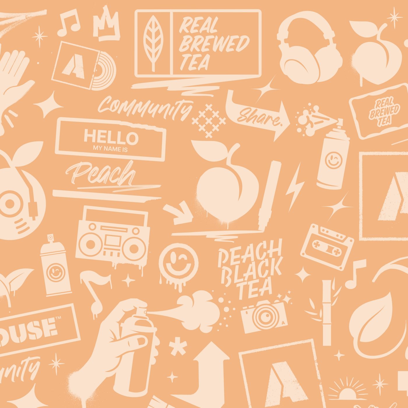 Flavors Pattern — Peach Black Tea
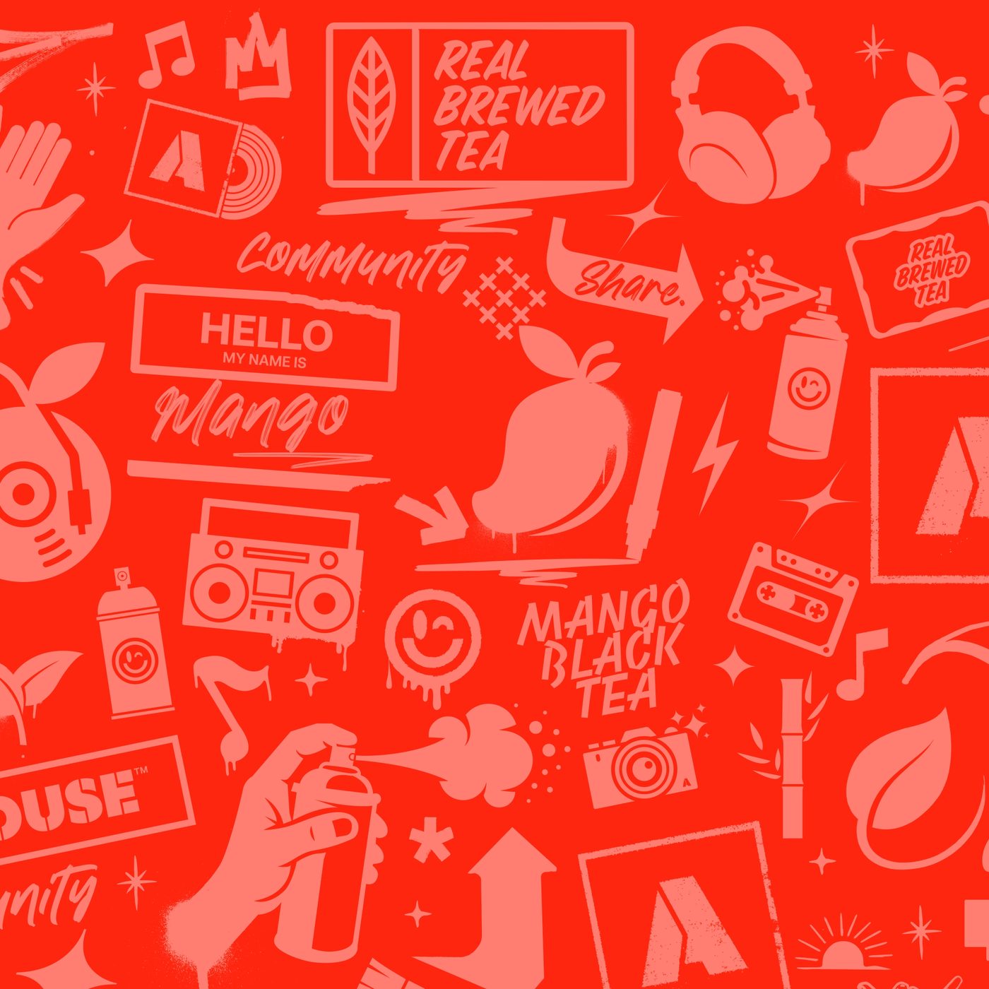 Flavors Pattern — Mango Black Tea
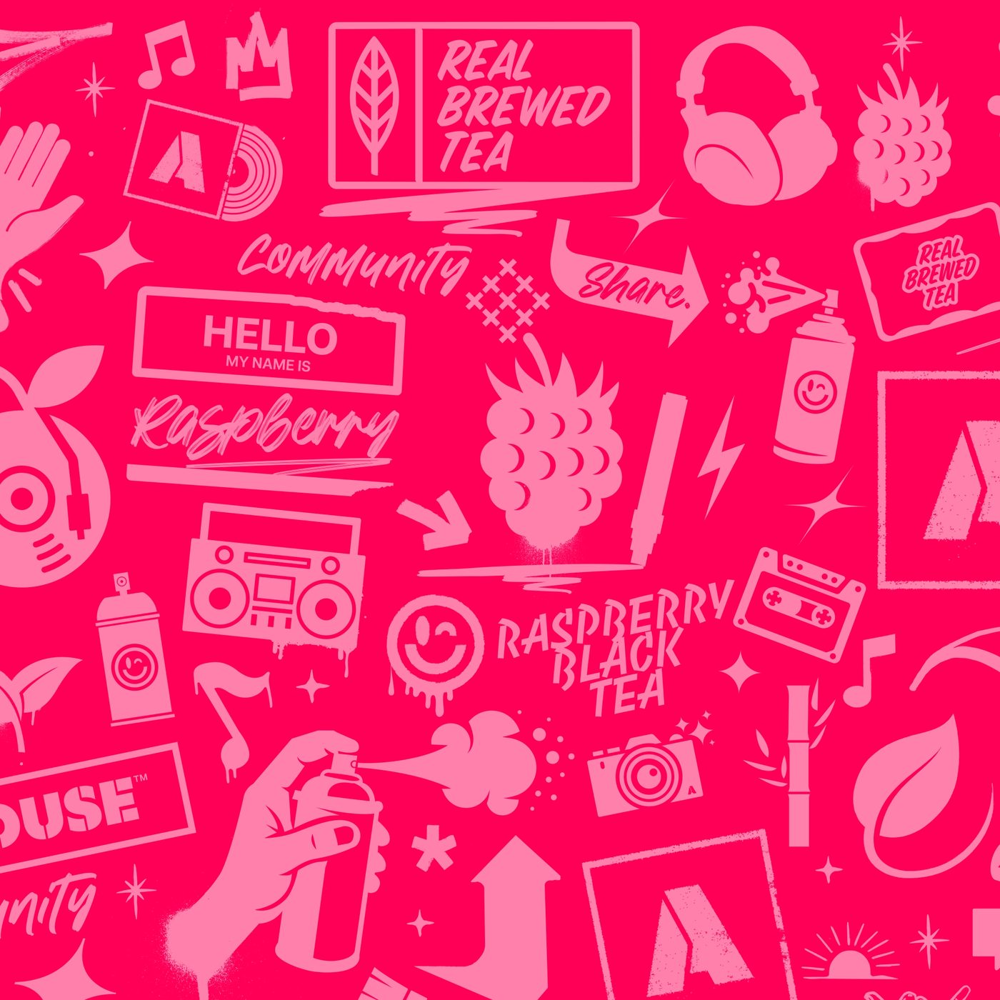 Flavors Pattern — Raspberry Black Tea
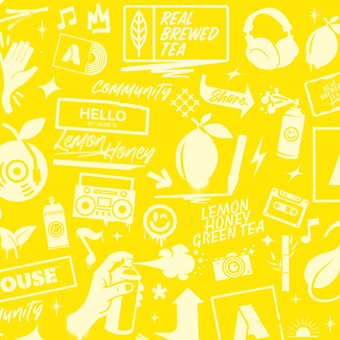 Flavors Pattern — Lemon Honey Green Tea
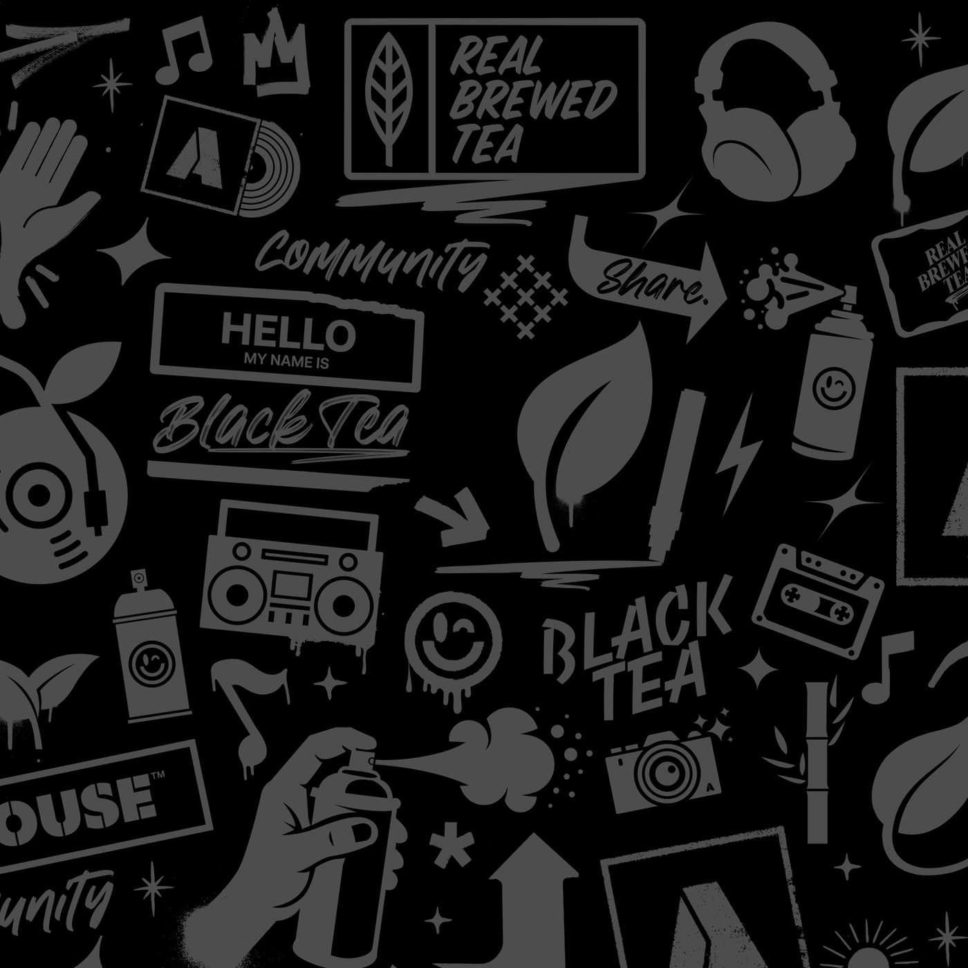 Flavors Pattern — Black Tea
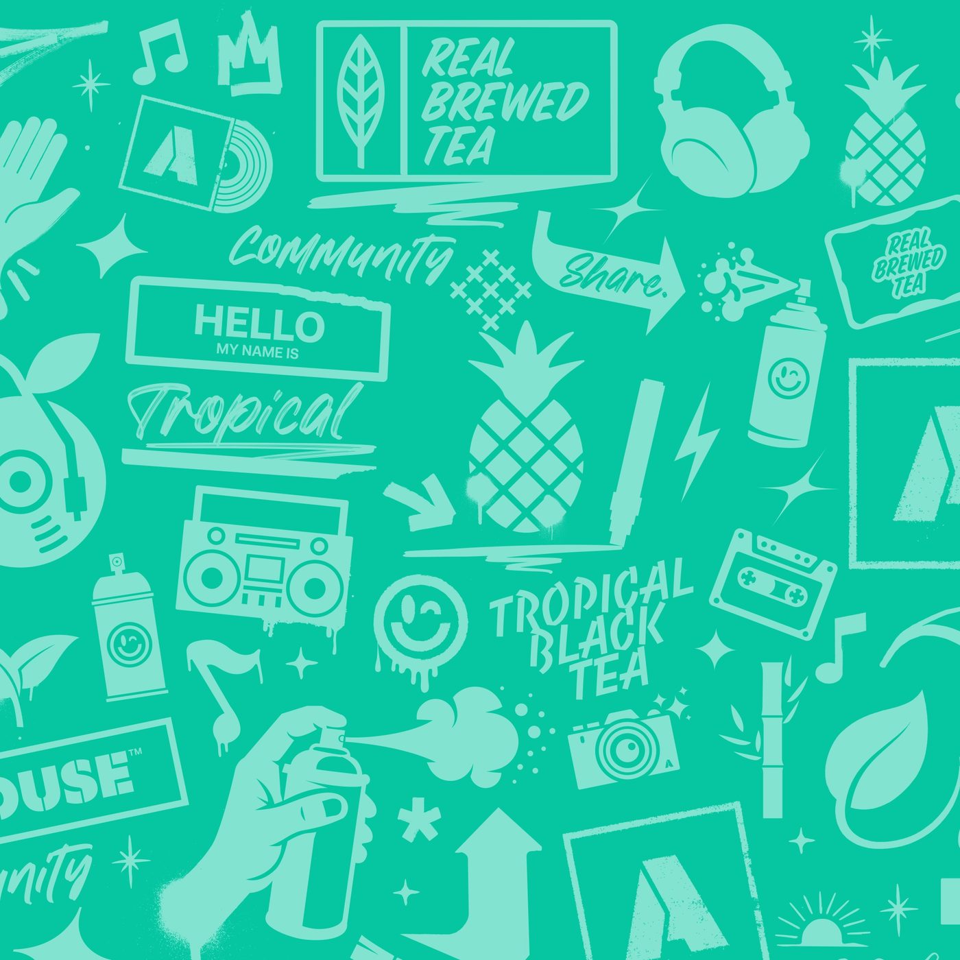 Flavors Pattern — Tropical Green Tea
 PeachBlack Tea
 MangoBlack Tea
 RaspberryBlack Tea
 Lemon HoneyGreen Tea
 Black TeaBlack Tea
 TropicalGreen Tea
Pattern Texture
The House Collection pattern is an embedded part of the brand identity system, functioning as a versatile texture treatment applied throughout marketing collateral, packaging, website design, and branded experiences.
 Pattern — Wet Paint
 Texture — Exercise Paper (Grid)
 Texture — Exercise Paper (Dot)
 Texture — Paper 04
 Texture — Paper 05
 Texture — Raspberry Black Tea (Rip)
Logotype & Brand Marks
The Arthouse mark is a house symbol: a square framed by a 4px Black Tea border, holding a centered glyph. Use Ink (#0A0A0A) on light surfaces; use White (#FFFFFF) reversed on Ink, Brand Orange, or photographic backgrounds with sufficient contrast. Don't recolor the mark in Accent Yellow, don't drop the border frame, and don't apply effects.






Components
A working set of the interactive components used throughout the home page. Specs are pulled directly from the Figma file: heights, radii, borders, and type sizes match what's in the comp.
Primary CTAs use Accent Yellow with Ink text. Secondary actions are outline buttons in white. Hero buttons drop to a 44px height with a tighter 5px radius. 13px USD Bold UPPER, letter-spacing 1.08px, padding 14x22, radius 5. Flat at rest; every button lifts on hover.
Each major section is anchored by a black 50x50 badge and a 1px Ink hairline that runs full-width with an eyebrow + "View All →" link.
LTD chips appear on artist cards over photographic backgrounds. The slight transparency and 0.75px border let them sit cleanly on top of imagery.
Used in "How it Works" and submission flows. Active step filled in Accent Yellow; inactive steps on Hairline grey with Muted text. (Tom's frame copy says "community votes"; site copy is always hearts.)
Translucent dark backgrounds with backdrop blur read against light or photographic content. Active dot is white and 24px wide; inactive dots are 10px and 45% white.
Eyebrow labels sit above H1 copy to enhance readability and structure: painted brush behind LIVE type, never a pill, brush breathing past the glyphs.
12px USD Extra Bold UPPER, +10% tracking, pill radius. Border = 1px Black for light fills.
Card backdrops use the can-coded accents, not the flavor palette.
Tropical
Product cards — House Collection#06D6E6
Lemon Honey
Product cards — House Collection#FFE802
Raspberry
Product cards — House Collection#FF2A8B
Peach
Product cards — House Collection#FC4600
Product cards combine an off-white image well with a footer row carrying avatar, title, sublabel, and a love count. The submission card uses a dashed Accent Yellow border to call out a contributor action.
The design system is built around strict proportion and scalable consistency. A 6px corner radius is the core standard (buttons run 5px).
In the Wild
Treatments the style-guide frame doesn't list but Tom's page comps and the live site use consistently. Each is labeled with its source so Tom can confirm or correct before these harden into canon.
First look at each Series. Open calls announced 48 hours early. Never spammy, never forwarded.
Vasconcellos
My art is a daydream. I get lost in the process of painting and drawing. It is the only part of my life that has never had rules.— Nora Vasconcellos
Certificate of Authenticity · Series 01 · Run of 10,000 · Summer 2026 ReleaseBlack Tea
- Real pineapple + passionfruit
- Brewed black tea base
- 24g sugar · Non-GMO
Six bands, one per flavor, each on its own illustrated pattern; Black Tea runs the dark variant. Rip-paper dividers seat every transition:
Six working artists, six limited-run cans.
Arthouse is truly an artist first company. They treated me with respect and honored my process and my work.— OG Slick · Read Whole Story →